

Introduction
A Gantt chart is a type of chart that illustrates the breakdown of a project into its component tasks. Google Gantt charts illustrate the start, end, and duration of tasks within a project, as well as any dependencies a task may have. Google Gantt charts are rendered in the browser using SVG. Like all Google charts, Gantt charts display tooltips when the user hovers over the data.
Gantt Chart Overview
A Gantt chart is a visual representation of a project schedule that shows the start and finish dates of various elements of the project. Named after Henry L. Gantt, who developed this type of chart in the 1910s, Gantt charts are widely used in project management to illustrate the timing of tasks and their dependencies.
-
Task Bars:
- Horizontal Bars: Each task is represented by a horizontal bar that spans the duration of the task.
- Position: The position of the bar along the timeline indicates when the task starts and ends.
-
Timeline:
- Horizontal Axis: The horizontal axis represents time, usually broken down into days, weeks, or months.
- Start and End Dates: Tasks are plotted along this timeline based on their start and end dates.
-
Task List:
- Vertical Axis: The vertical axis typically contains a list of tasks or activities.
- Task Names: Each task is listed along this axis, making it easy to identify and track.
-
Duration:
- Length of Bars: The length of each task bar corresponds to the duration of the task.
- Dependencies: Dependencies between tasks are often indicated by linking bars.
-
Milestones:
- Key Points: Milestones are represented as key points in the timeline.
- Significant Achievements: They signify the completion of a significant phase or achievement in the project.
-
Dependencies:
- Arrows or Lines: Dependencies between tasks are shown using arrows or lines connecting the related task bars.
- Sequential Tasks: Indicates the order in which tasks must be completed.
-
Progress:
- Shading or Coloring: Gantt charts often use shading or coloring to indicate the progress of each task.
- Completed and Remaining: Completed portions are shaded, and the remaining portions are left open.
-
Resource Allocation:
- Resource Assignment: Some Gantt charts include resource allocation, indicating which team member is responsible for each task.
- Workload Management: Helps in managing workload distribution across team members.
-
Critical Path:
- Critical Tasks: The critical path represents the sequence of tasks determining the minimum time needed for the project.
- Project Duration: Identifying critical tasks is crucial for managing the project timeline.
-
Software Tools:
- Digital Solutions: Gantt charts can be created using various software tools and project management platforms.
- Collaboration: Facilitates collaboration and real-time updates among team members.
Objective
Develop a Gantt chart visualization to represent the progress and timelines of Opportunities within the Salesforce platform. This chart will focus on displaying the various stages that Opportunities go through in their lifecycle.
Implementation Steps
-
Set Up Salesforce
Ensure that your Salesforce instance is set up with the necessary permissions to create custom objects, fields, and Apex code if required.
-
Custom Object Creation
Create a custom object to represent the Gantt chart items. This object could include fields such as Opportunity Stage, Start Date, End Date, and any other relevant information.
-
Data Population
Populate the custom object with data reflecting the Opportunity Stages and their corresponding timeframes.
-
Visualforce Page or Lightning Web Component
Create a Visualforce page or a Lightning Web Component to display the Gantt chart. Use the data from the custom object to generate the Gantt chart visuals dynamically.
-
Apex Controller or Apex Class (if using Visualforce)
Write an Apex controller or an Apex class to handle the backend logic for fetching and processing the data from the custom object.
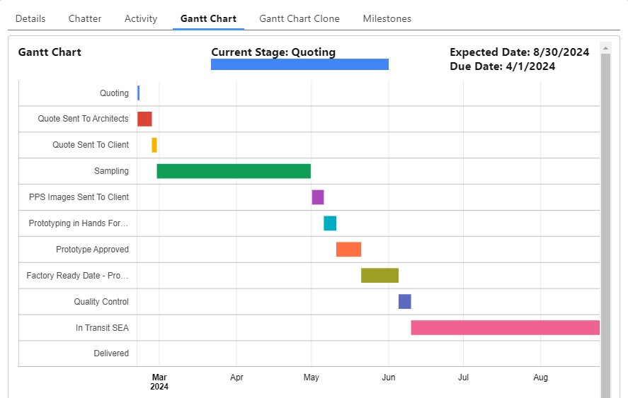
Gantt Chart Visualization
Conclusion
The implementation of a Gantt chart for Salesforce Opportunity stages is a valuable enhancement to visualize and manage the progression of opportunities through various stages. By mapping each stage to custom timelines and utilizing a Gantt chart library within a Visualforce page or Lightning Web Component, users can gain a comprehensive view of opportunity timelines, durations, and current stages. The dynamic nature of the chart allows for real-time updates, ensuring accuracy and relevance. User interaction features such as tooltips, filtering, and sorting options enhance usability. Thorough testing, including unit and user acceptance testing, is crucial for a successful deployment. Providing clear documentation for end-users and administrators facilitates effective utilization and customization of the Gantt chart, contributing to a more intuitive and efficient Salesforce Opportunity management experience. If you are looking to implement Gantt chart for Salesforce, get in touch with us. As a trusted Salesforce development company in USA, we can help you implement it effectively.