Salesforce Lightning Design System (SLDS) 2 (Beta)

Overview
The Salesforce Lightning Design System (SLDS) 2 is a modern CSS framework designed to produce harmonious, accessible, and responsive user interfaces for Salesforce applications and external web projects. Built with mobile-first principles and WCAG 2.1 compliance, SLDS 2 provides a robust set of components, utility classes, and design tokens to streamline development while ensuring a polished user experience aligned with Salesforce’s Lightning Experience.
This document covers setup, key components, advanced usage, accessibility, integration tips, troubleshooting, and best practices for leveraging SLDS 2 effectively.
Installation and Setup
SLDS 2 can be integrated into Salesforce Lightning components or standalone web applications.
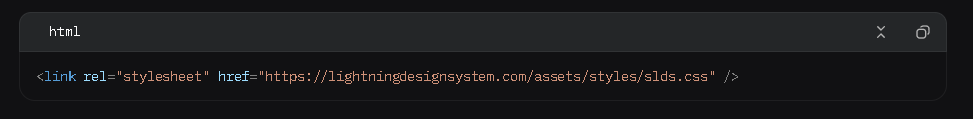
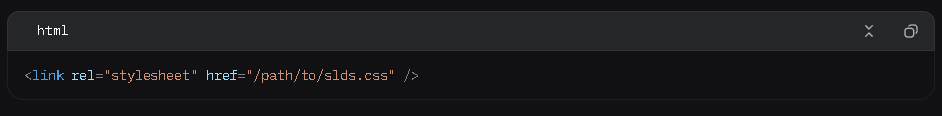
Via CDN
Include SLDS 2 using the official CDN:
Local Download
Download the SLDS package from lightningdesignsystem.com and host it locally:
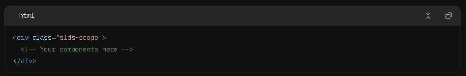
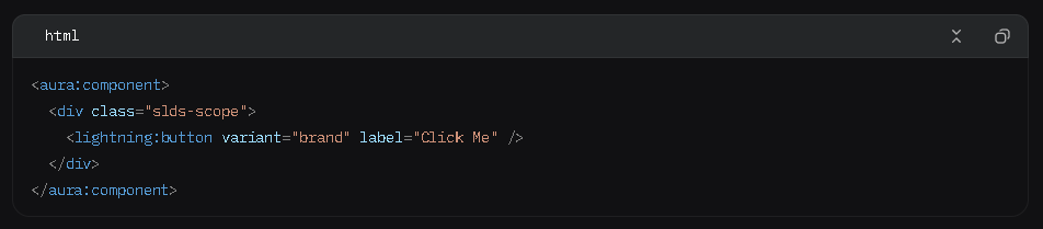
In Salesforce
SLDS 2 is natively available in Lightning Web Components (LWC) and Aura components. Wrap your markup in the slds-scope class:
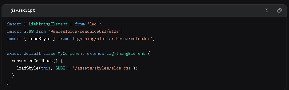
For LWC, import if needed:
Core Components
SLDS 2 offers a wide range of pre-styled components. Below are detailed examples of commonly used components.
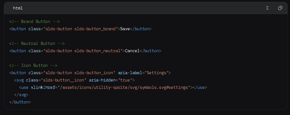
Buttons
SLDS 2 provides various button styles for different use cases:
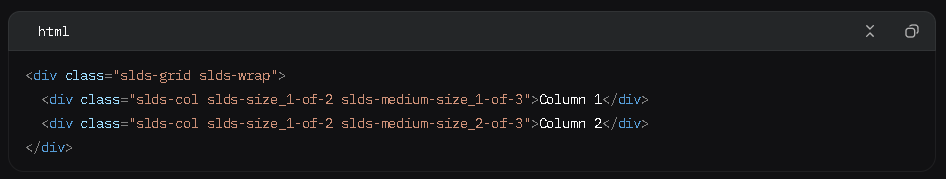
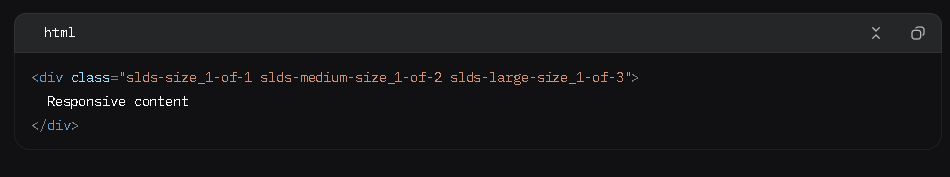
Grid System
The responsive grid system supports flexible layouts:
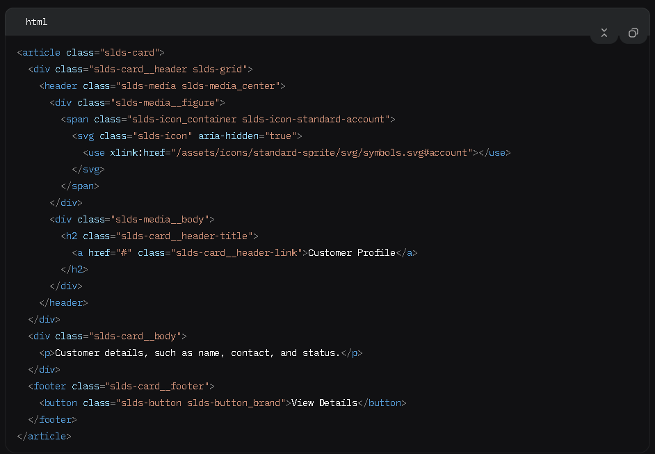
Cards
Cards organize content in a structured, visually appealing way:
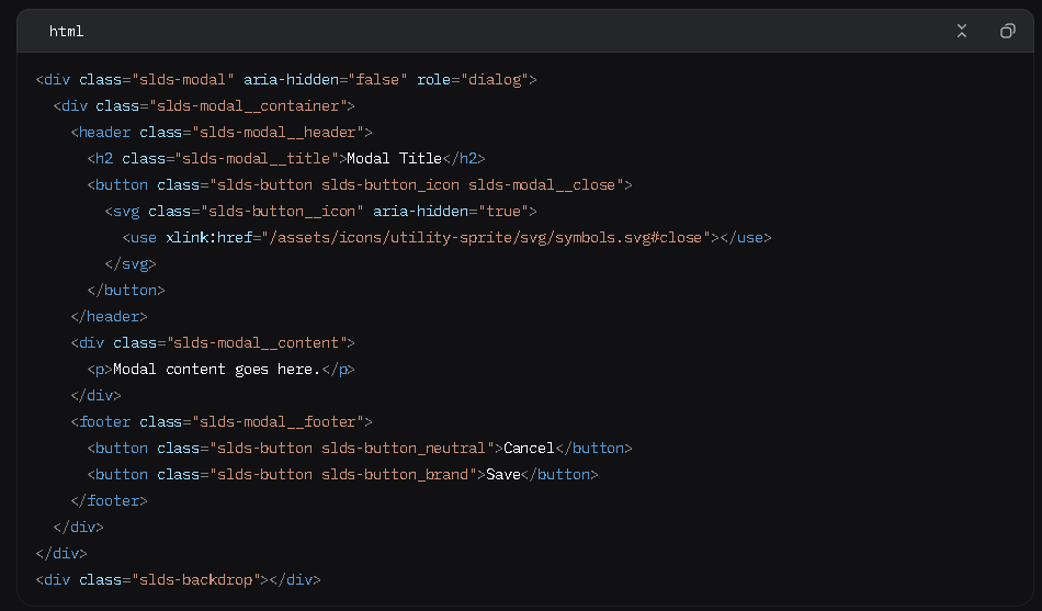
Modals
Modals are used for focused interactions:
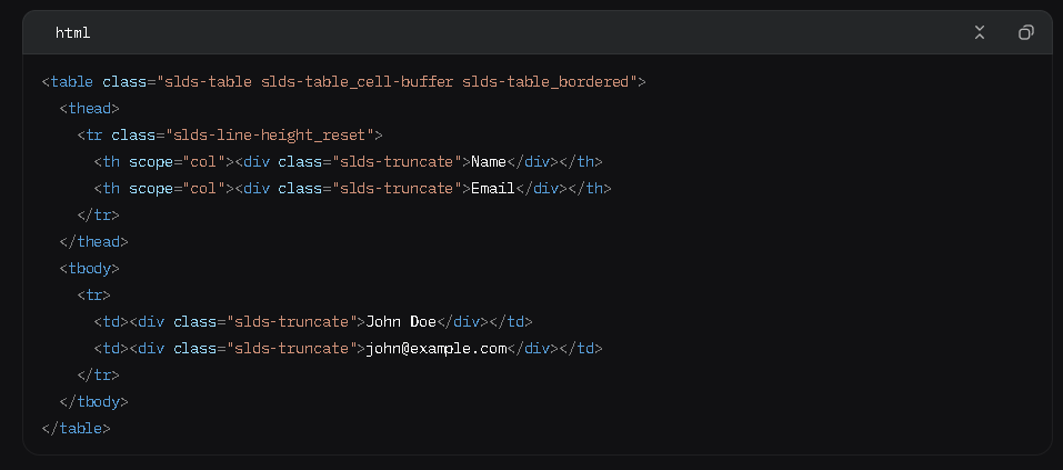
Data Tables
Display tabular data with sorting and selection:
Utility Classes
SLDS 2’s utility-first approach simplifies styling:
- Spacing: slds-m-top_small, slds-p-around_large
- Typography: slds-text-heading_medium, slds-text-color_success
- Alignment: slds-text-align_right, slds-float_left
- Visibility: slds-hide, slds-show_medium
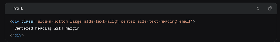
Example:
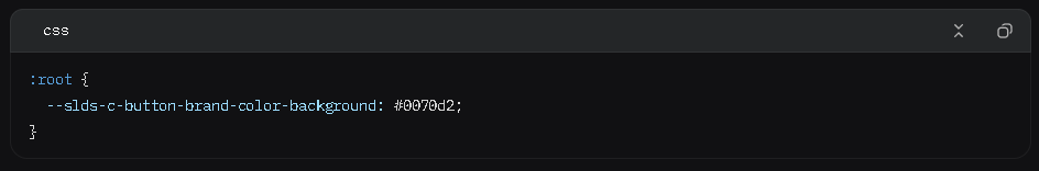
Design Tokens
SLDS 2 uses design tokens for consistent theming (e.g., colors, fonts, sizes). Example:
Refer to the SLDS Tokens documentation for a full list.
Accessibility
SLDS 2 is designed for WCAG 2.1 compliance:
- ARIA Attributes: Use aria-label, aria-describedby, and aria-hidden as needed.
- Keyboard Navigation: Ensure all interactive elements are focusable with tabindex.
- Color Contrast: Verify contrast ratios meet accessibility standards.
- Testing Tools: Use WAVE, axe, or Salesforce’s Accessibility Toolkit.
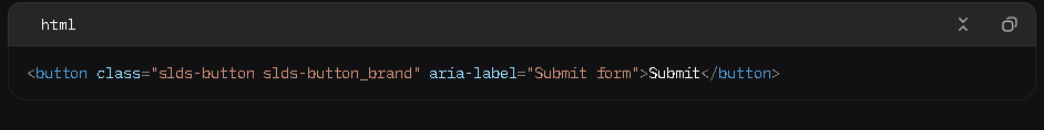
Example for accessible buttons:
Integration with Salesforce
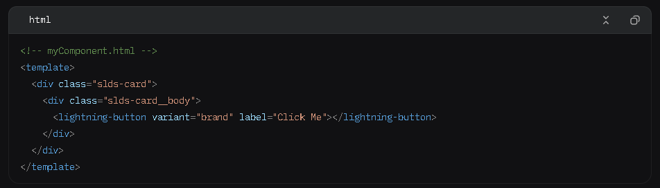
Lightning Web Components (LWC)
Use SLDS 2 in LWC by applying classes directly:
Aura Components
Apply SLDS classes in Aura markup:
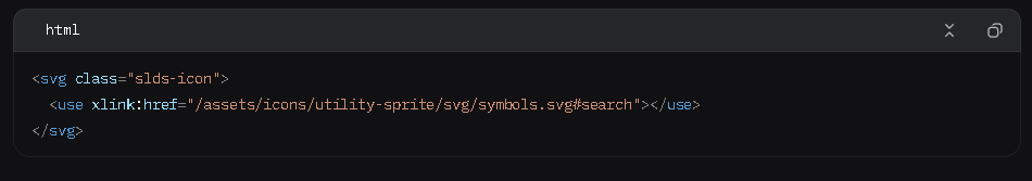
External Applications
For non-Salesforce apps, include SLDS 2 via CDN or local files and use the slds-scope class. Ensure icons are accessible by including the SLDS sprite assets:
Advanced Usage
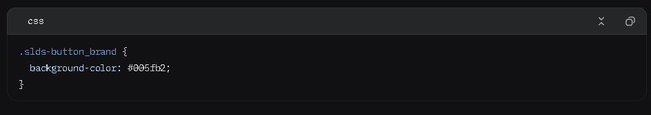
Customizing Components
Override SLDS styles cautiously using custom CSS or design tokens:
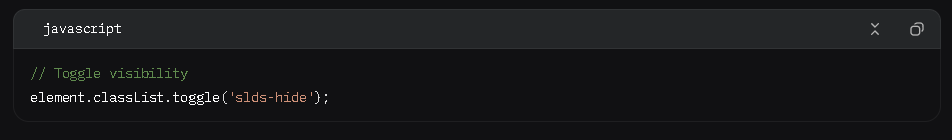
Dynamic Components
Use JavaScript to toggle SLDS classes for dynamic behavior:
Responsive Design
Leverage SLDS responsive classes:
Troubleshooting
- Styles Not Applied: Ensure slds-scope is used and the CSS file is correctly loaded.
- Icon Issues: Verify the sprite path is correct (e.g., /assets/icons/…).
- Accessibility Errors: Check ARIA attributes and test with screen readers like NVDA or VoiceOver.
- Responsive Breakpoints: Use slds-show_* and slds-hide_* classes for device-specific visibility.
Best Practices
- Adhere to SLDS Patterns: Follow component blueprints to maintain consistency.
- Minimize Custom CSS: Use utility classes to reduce maintenance overhead.
- Optimize Performance: Include only required SLDS modules via scoped imports or CSS purging.
- Test Across Devices: Validate responsiveness using browser dev tools or real devices.
- Monitor Updates: Check SLDS Release Notes for new features and bug fixes.
- Document Customizations: Maintain a style guide for any custom SLDS modifications.
Resources
- Official Site: Salesforce Lightning Design System
- Component Library: SLDS Components
- Accessibility Guide: SLDS Accessibility
- Icons: SLDS Icons
- Community: Salesforce Developer Community
Conclusion
SLDS 2 is a versatile framework for building modern, accessible, and responsive interfaces. Its extensive component library, utility classes, and design tokens make it ideal for Salesforce developers and external web projects. By following this documentation, you can leverage SLDS 2 to create consistent, high-quality applications efficiently.
For further assistance, explore the official SLDS resources or engage with the Salesforce developer community. Whether you’re building custom Lightning apps internally or collaborating with a Salesforce consultant in USA, SLDS 2 ensures a consistent, user-friendly experience aligned with Salesforce’s Lightning standards.

As Company Director and Architect, Vrutik leads Salesforce and cloud initiatives.
related blog