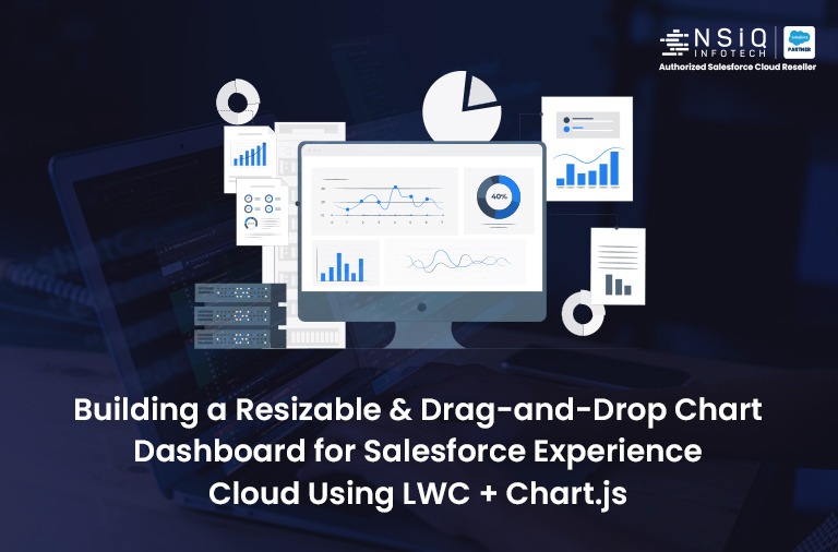
Building a Resizable & Drag-and-Drop Chart Dashboard for Salesforce Experience Cloud Using LWC + Chart.js

Tech stack: Experience Cloud, LWC, Apex, Chart.js, Custom Object
Use case: External User Dashboard in Partner or Customer Portal
Why I Built This
When working with Salesforce Experience Cloud, I often need to give partners or customers a visual dashboard with analytics from reports — without giving them access to full Salesforce dashboards.
Unfortunately:
- Standard dashboards are not flexible inside Experience Cloud
- They often don’t render well on mobile or custom layouts
- Users want to drag, resize, and customize views — which standard dashboards don’t allow
So, I built my own — using Lightning Web Components, Chart.js, and custom object to store chart settings. And now, I have a fully dynamic dashboard embedded directly into a Salesforce community page that works for any external user.
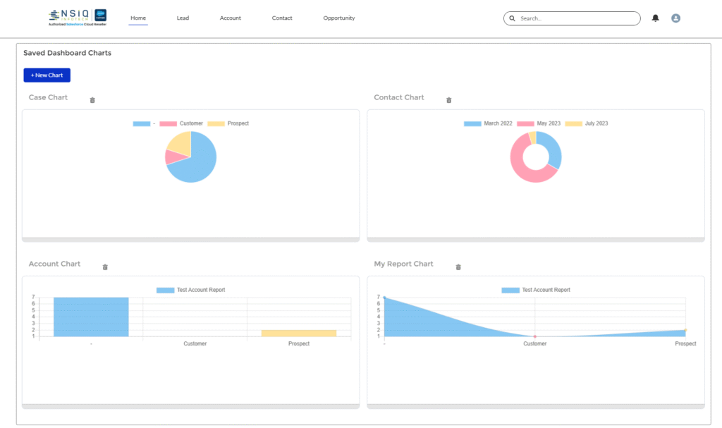
Key Features
Here’s what the dashboard supports:
- View saved report-based charts
- Drag-and-drop to reorder charts
- Resize any chart by dragging
- Create/edit charts in a modal
- Save chart layout settings per chart
- 100% compatible with Experience Cloud
Components Overview
I used two main Lightning Web Components:
- DashboardViewer
This is the main UI component that:
- Loads all chart configs
- Displays charts in a flexible layout
- Lets users drag and resize charts
- Opens a modal for chart creation/editing
- ReportChart
Each chart is rendered using Chart.js based on a Salesforce Report.
How It Works (Step-by-Step)
1. Loading Charts for External Users
All chart settings are stored in a custom object (ChartConfig__c). When the component loads, it fetches the charts using an Apex method:
Apex:
@AuraEnabled(cacheable=true)
public static List getSavedCharts() {
return [SELECT Id, Name, ReportId__c, ChartType__c, Height__c, Width__c, Position__c FROM ChartConfig__c ORDER BY Position__c];
}
Make sure guest/partner users have access to the object and fields.
2. Showing Charts in a Community Page
In your Experience Builder, just drag the DashboardViewer component into a section. You can wrap it in a if needed, or place it directly in a content slot.
Each chart is displayed inside a tile:
Html:
<c-report-chart
report-id={chart.ReportId__c}
chart-type={chart.ChartType__c}>
</c-report-chart>
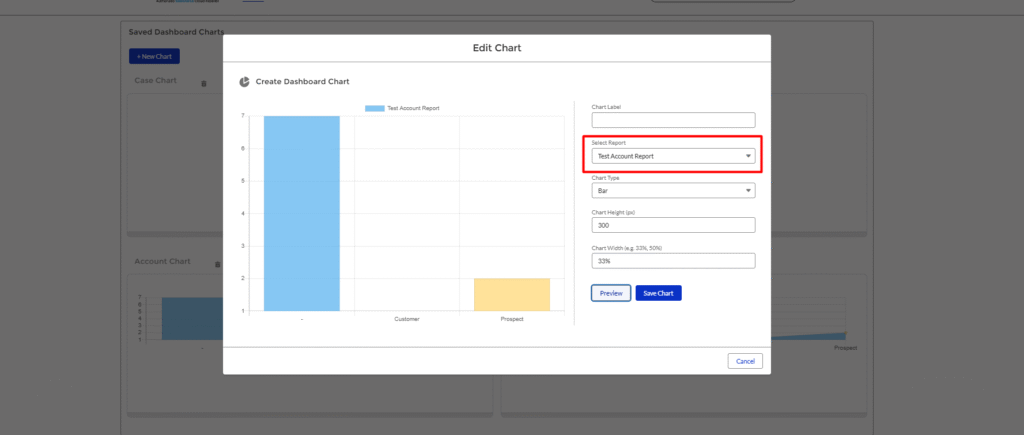
3.Creating or Editing Charts
Users can click + New Chart or an existing chart title to open a modal (). The same component handles both create and update operations.
Html:
<c-chart-builder
record-id={editRecordId}
onchartcreated={handleChartBuilderCreateChart}>
</c-chart-builder>
- If record-id is null, it creates a new chart.
- If a value is passed, it loads the chart for editing.
4.Resizing Charts Live
Users can drag the bottom of each chart to change its height. This is especially useful when you have different chart types or lots of data.Resize is stored in the backend using Height__c.
Java Script:
chart.computedStyle = `min-height:${newHeight}px;flex-basis:${chart.Width__c || ‘33%’};`;
5.Drag-and-Drop Reordering
Each chart tile is draggable. When dropped onto another tile, their positions are swapped. That new order is saved using Position__c on the custom object.
This allows each chart to remember where it belongs even after refreshing or reloading the page.
The Chart Engine: ReportChart + Chart.js
Inside each chart tile, the ReportChart component uses Chart.js to render the data.
What happens:
- Chart.js is loaded from a static resource
- Data is fetched from Apex via getChartData()
- Chart is rendered inside a <canvas>
Apex Method:
@AuraEnabled
public static ChartDataWrapper getChartData(Id selectedReportId) {
// return labels, values, and optional title
}
JavaScript Logic:
getChartData({ selectedReportId: this.reportId })
.then((result) => {
this.chart = new window.Chart(ctx, {
type: this.chartType,
data: {
labels: result.labels,
datasets: [{ data: result.values }]
},
options: {
responsive: true,
maintainAspectRatio: false
}
});
});
Why It’s Perfect for Experience Cloud
This setup is ideal for communities because:
- It respects public or external sharing rules
- It can be fully styled to match your portal theme
- It allows external users to see real-time charts from Salesforce reports
- It avoids limitations of standard report charts in Experience Cloud
- All data and layout is controlled by Apex and LWC, so you have total flexibility
Security Notes
Make sure:
- Your ChartConfig__c object is exposed to guest/partner profiles
- Apex methods use @AuraEnabled safely and check FLS
- Reports are shared with the appropriate Experience Cloud users
Conclusion
This custom chart dashboard gave me exactly what I needed for my Salesforce community:
- Flexible layout
- Real-time charts
- Full control over UI
- Easy drag-and-drop + resize
- Works on desktop, mobile, and tablet
If you’re building a partner portal, customer hub, or analytics workspace in Experience Cloud, this approach is a game changer. Companies investing in Salesforce Lightning App Development in USA can use similar frameworks to deliver engaging, scalable solutions for external users.
Let’s Connect
If you want the full source code, help customizing this for your community, or want to turn this into a managed package — feel free to reach out.

Experienced Senior Salesforce Developer specializing in Apex, LWC, and system integrations. Passionate about building scalable solutions and optimizing business processes for maximum efficiency.
related blog