Welcome to the Salesforce Lightning Design System (SLDS)
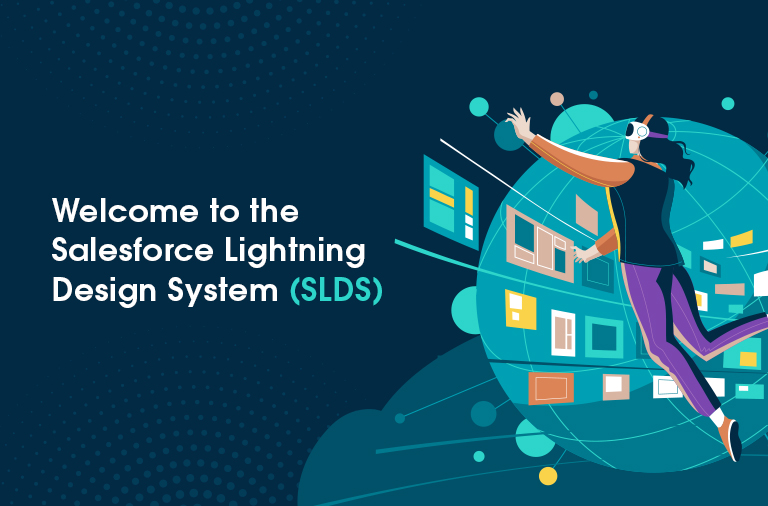
Salesforce Lightning Design System (SLDS) is a comprehensive set of design standards aimed at harmonizing the appearance and functionality of custom components within Salesforce applications. It ensures a consistent and intuitive user experience across different platforms.
SLDS is heralded as the “world’s first living, open-source, enterprise, accessible, platform-agnostic design system” by Salesforce. It provides a structured framework comprising reusable design patterns that promote clarity, efficiency, consistency, and aesthetic appeal.
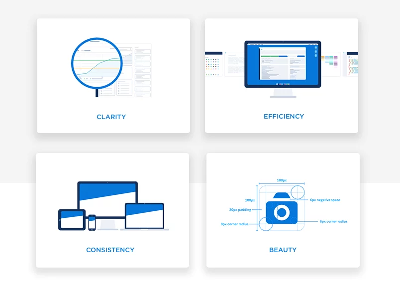
- Clarity: Ensures users can easily navigate and find what they need.
- Efficiency: Promotes development efficiency through reusable components.
- Consistency: Maintains uniformity in user experience across the system.
- Beauty: Enhances visual appeal to encourage user engagement and adoption.
These principles are integral to SLDS, making it an essential tool for developers aiming to deliver seamless and visually appealing applications within the Salesforce ecosystem.
An In-Depth Guide to Salesforce Lightning Design System (SLDS) in 2024
Introduction
Salesforce Lightning Design System (SLDS) is a powerful framework designed to streamline the development of applications on the Salesforce platform. By providing a comprehensive set of guidelines, components, and design tokens, SLDS ensures a consistent, accessible, and high-performance user experience. In 2024, SLDS introduced several exciting updates and new features, enhancing its capabilities further, making it a valuable resource for any Salesforce development company in USA.
What is the Salesforce Lightning Design System?
The Salesforce Lightning Design System is a collection of design patterns, components, and best practices that enable developers to create user interfaces with the same visual consistency as Salesforce’s native apps. It provides a library of reusable components, such as buttons, forms, and cards, along with design tokens for consistent styling.
Benefits of Using SLDS
- Consistency: SLDS ensures that all applications have a uniform look and feel, which enhances the user experience.
- Efficiency: With pre-built components and design tokens, developers can quickly assemble interfaces without reinventing the wheel.
- Accessibility: SLDS components are designed with accessibility in mind, ensuring that applications are usable by everyone, including those with disabilities.
What’s New in SLDS 2024?
1. Enhanced Accessibility Features
SLDS 2024 introduces improved ARIA support and new accessibility guidelines to help developers create more inclusive applications.
2. New Components and Utilities
Several new components, such as the Progress Ring and Dual Listbox, have been added. Additionally, utility classes have been expanded to provide more flexibility in layout and styling.
3. Performance Optimizations
Optimizations have been made to reduce the overall footprint of SLDS, making applications faster and more responsive.
4. Improved Documentation
The SLDS documentation has been revamped with more examples, better organization, and enhanced search functionality to help developers find what they need quickly.
Getting Started with SLDS
Installation
To start using SLDS in your Salesforce project, follow these steps:
- Navigate to the SLDS website: Go to Salesforce Lightning Design System.
- Download the latest version: Ensure you get the most up-to-date version to leverage the newest features and fixes.
- Integrate with Salesforce: Follow the detailed instructions on the SLDS website to integrate SLDS into your Salesforce project, either by using the static resource method or by leveraging the SLDS package.
Basic Setup
Once SLDS is integrated, you can start using it in your Lightning components.
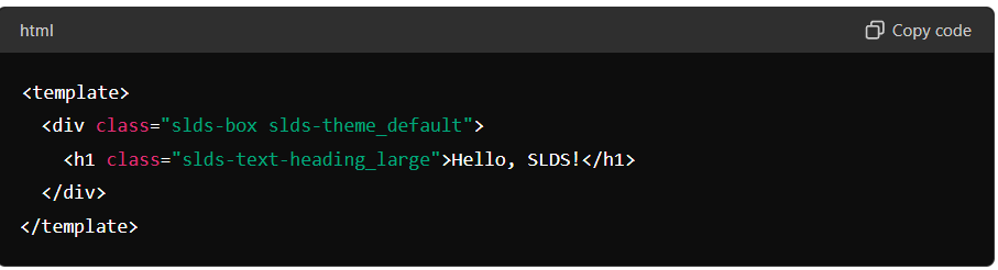
This simple example demonstrates how to apply SLDS classes to your Lightning Web Components (LWC).
SLDS Architecture and Components
Architecture
The SLDS architecture is modular, allowing developers to include only the components they need. It consists of:
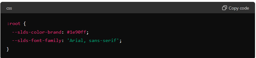
- Design Tokens: Variables that store visual design attributes like color, spacing, and typography.
- Utility Classes: Reusable classes for common styles.
- Component Blueprints: HTML and CSS for standard UI components.
Components
SLDS includes a wide range of components, such as:
- Buttons: Standard, neutral, brand, destructive, and success buttons.
- Forms: Inputs, text areas, checkboxes, and radio buttons.
- Modals: Dialogs for user interactions.
- Data Tables: Structured data presentation.
New Components in 2024
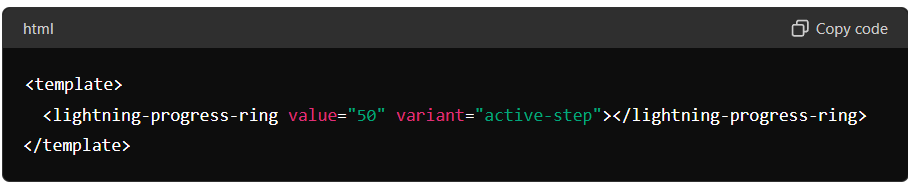
Progress Ring
The Progress Ring component visually represents the completion percentage of a task or process.
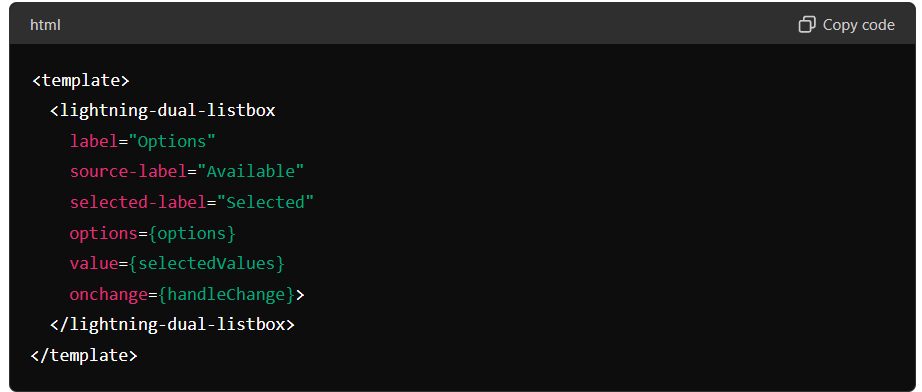
Dual Listbox
The Dual Listbox component allows users to move items between two lists.
Using SLDS in Your Project
Practical Examples
Here’s an example of using SLDS components in a Lightning Web Component:
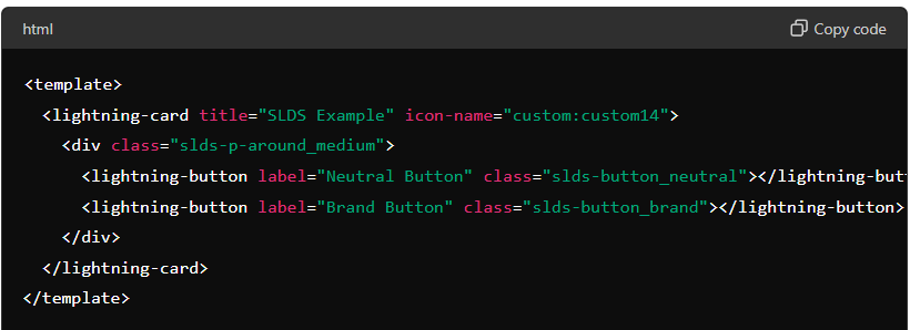
This example shows how to use SLDS classes to style Lightning buttons within a card component.
Customizing SLDS
Theming
SLDS allows you to customize the look and feel of your application through theming. You can modify design tokens to change colors, fonts, and other style attributes.
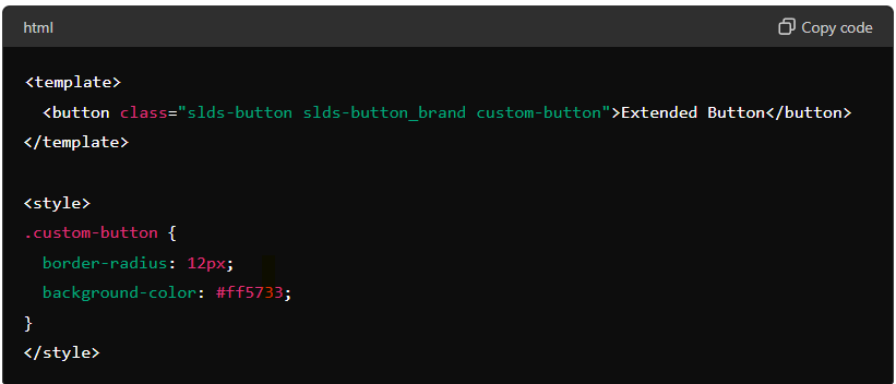
Extending Components
Sometimes, you may need to extend SLDS components to meet specific requirements. Here’s an example of extending a button component:
Best Practices
Consistency
- Use Design Tokens: Always use design tokens to maintain consistency across your application.
- Follow Guidelines: Stick to SLDS guidelines for component usage and styling.
Performance
- Load Only What You Need: Avoid loading unnecessary components and styles to improve performance.
- Optimize Images: Use optimized images to reduce load times.
Accessibility
- Use ARIA Attributes: Make use of ARIA attributes to enhance accessibility.
- Test with Screen Readers: Ensure your application is usable with screen readers.
Common Issues and Troubleshooting
Typical Problems
- Component Overlap: Ensure you are using the correct SLDS classes and following the guidelines to avoid layout issues.
- Styling Conflicts: Be cautious of custom styles that might conflict with SLDS classes.
Solutions
- Refer to Documentation: Always refer to the official SLDS documentation for guidance.
- Community Forums: Engage with the Salesforce community to find solutions to common problems.
Resources and Further Learning
- Official Documentation: Salesforce Lightning Design System
- Trailhead Modules: Salesforce offers comprehensive modules on Trailhead for learning SLDS.
- Community Forums: Participate in forums like Salesforce Stack Exchange and the Trailblazer Community.
Conclusion
The Salesforce Lightning Design System is an essential tool for developers looking to create consistent, accessible, and high-performance user interfaces on the Salesforce platform. By following the guidelines and best practices outlined in this guide, you can leverage SLDS to its fullest potential and build applications that delight users.
Call to Action
Start using the Salesforce Lightning Design System today and see how it can transform your development process. Share your experiences and join the growing community of SLDS developers!

Seasoned Senior Salesforce Developer with deep expertise in Apex, Lightning Web Components (LWC), and complex integrations. Proven track record of delivering scalable, high-performance solutions and optimizing business processes to drive efficiency and growth.
related blog